

Temps de lecture : 4 min
Key Takeaways
- Royal distinction: The crown, granted in 1951, sets the club apart.
- Heraldic storytelling: The shield blends golf, regional identity, and history.
- Design balance: Colors and symbols work together for versatile use on apparel and merchandise.
A Crest That Speaks: Royal Birkdale
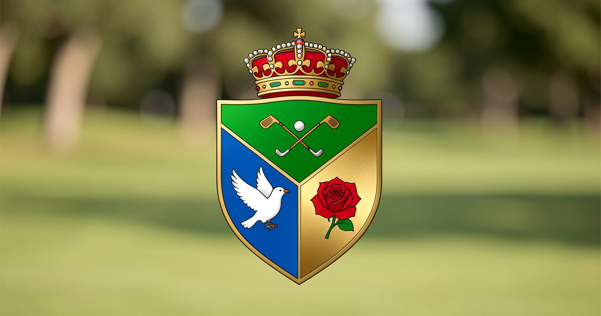
The Royal Birkdale crest is more than a logo—it’s a condensed history of the club and its place. I’ve studied it during a few pauses on the course, and there’s a lot to unpack. Here’s the thing nobody talks about: the recent refinements made it both more usable and more historically faithful.
Read top to bottom, it tells a clear story:
- Royal status at the crown
- The game itself in the crossed clubs and ball
- Regional roots in the bird and rose
The Crown: A Royal Seal
The crown is the most obvious nod to history. Birkdale earned the “Royal” title in 1951, and that honor is embedded in the emblem. Without it, the shield might look like a municipal badge; with it, the identity is unmistakably royal.
In design terms, the crown adds height and ceremony. It draws the eye up and sets a formal tone. That’s not just decoration—it’s a signal of institutional pride.
The Shield: Structure and Identity
The shield is the backbone, borrowing from British heraldry to evoke continuity and membership. Its shape works on blazer pockets, flags, scorecards, even embroidery. It’s not minimalist—deliberately so.
The shield divides into two main parts:
- One horizontal panel at the top
- Two vertical panels below
That layout creates a clear hierarchy: sport first, then place.
The Crossed Clubs and Ball
In the green upper panel, two crossed golf clubs frame a ball. This is the most literal part of the crest—it announces the club’s purpose. The crossed arrangement echoes heraldic weapons, like swords translated into golfing language.
The green background naturally evokes turf and linksland. It’s a perfect marriage of sport and setting.
The Bird in Flight
Below left, a white bird on blue—most take it as the Liver bird, linking the club to Liverpool and Merseyside. The bird’s spread wings add a sense of coastal air and open development. It also balances the static rose on the other side.
It’s a dynamic touch, hinting at movement and freedom.
The Red Rose of Lancaster
Below right, the Red Rose of Lancaster sits on a gold field. Historically, Birkdale and Southport were part of Lancashire until Merseyside was created in 1974. The rose anchors the club in its pre-1974 county identity—a subtle but powerful historical marker.
The gold background provides heraldic richness, and the five-petalled form is the conventional stylized rose, not a botanical drawing. Together, the bird and rose capture Birkdale’s position between two regional identities.
Color Choices That Work
The palette is careful: green carries the golf reference, red and gold convey warmth and tradition, blue balances the warmer tones, white adds clarity, and black ensures the emblem reproduces well in embroidery or small sizes. It’s a masterclass in functional design.
This crest is one of the strongest in any club portfolio. It honors the past while adapting to modern needs—exactly what classic golf should be.

Playing golf since before GPS rangefinders existed. Eddie covers the classic game — courses, technique, and the stories worth keeping.